Sketchy Trees and Earthy Pebbles: January and February Spoonflower Design Challenges
In 2025 I am taking a deeper dive into pattern making. Last year, I learned the fundamentals of Adobe Illustrator and I put together my first complete fabric collection, TREAD, which is now available on Spoonflower. That accomplishment still looms large; you never have another first fabric collection. Now we are transitioning to a period of refining my skills and experimentation. While my larger project is to create a cohesive second fabric collection (I’m so excited; it is going to be so fun but a big challenge!), I want to use Spoonflower challenges as a way to experiment, play, and try new ways of thinking about my patterns. Each month, Spoonflower has two challenges open at any given time. The benefits of participating are more eyes on your work and prizes for the patterns with the top votes. There are often hundreds of submissions, so it takes a lot to stand out from the crowd.
My goal for 2025 is to try and enter at least one challenge each month, but to use artwork that I am already creating in my personal work, either in my paintings or my sketchbook. The goal isn’t to create artwork specifically for a challenge, but to look at the artwork I am already creating in a different way. In this post, I’ll take you behind the scenes of the January and February challenges. If you want to learn about any new patterns I recommend you follow along on Instagram or subscribe to my newsletter. That’s the fastest way to find out about new patterns and how you can vote on my submissions.
January Challenge: Accent Wall Wallpaper
Challenge Details: This week’s Accent Wall Design Challenge is all about creating designs that would make a statement with wallpaper. Consider bold, large-scale designs that would bring the wow factor to a single wall. An accent wall helps to draw the eye and define a space, so produce a print that’ll add instant character and charm.
For January’s challenge, I decided that my motifs (individual designs) would be trees. I have spent months drawing trees with my micron pens. Tall trees, short trees, skinny trees, mangy trees, pine trees, winter trees, all manner of trees. Most of these trees have a sketched quality. They are all combinations of marks and scribbles. Illustrator generally likes closed shapes, which are easier to recolor and you do not have to worry about seeing through motifs. With these trees, they would specifically have holes and I wanted to see if I could translate them into usable motifs. I decided to draw a series of trees in my larger sketchbook. After scanning and vectorizing them, I decided that I wanted some of the motifs to stay transparent, so if a tree was on top of the other, you would see the other peeking through behind it. For other trees, I decided to add a background layer so that they would stand out from each other. I needed to remind myself of some of Illustrator’s features and I think that there may be easier ways to accomplish this layered effect that I wanted, but we got it done. This is the whole goal of entering these challenges this year: to practice in Adobe Illustrator and look at my art in new and different ways.
Original sketched trees.
Vectorized and recolored.
Since this design was specifically for wallpaper, I wanted the motifs to be quite large. In the final pattern, the smallest tree measures thirteen inches tall, while the largest tree is twenty-four inches. It took a lot of playing to determine how densely I wanted the trees to be and how many vertical rows to have before the pattern repeats. For a color palette, I chose deep purple, teals, and gold. This called for more playing. I wanted some colors to feel more muted so that you would notice them after looking at the pattern for a while. Others I wanted to really pop, like the gold trees. Overall, I’m pleased with how this pattern came out. I learned how to work with a sketched and scribbled motif and it was fun to learn the specifications of Spoonflower wallpaper. This was also my first time working on a very large scale. I wanted the motifs to be large enough to make a statement on a wall, but was also surprised how much I liked the design on some of Spoonflowers other home decor items, like curtains and a duvet cover. I think this pattern could be eye-catching as a mural, where the trees are even larger, as wrapping paper or gift wrap for the holidays, or even shrunk down in scale as the cover for a journal.
Designed pattern in Illustrator
Pattern as a jpeg file.
Challenge Results: I came in 1010 out of 1934 entries in the Spoonflower challenge with 33 votes. Top design got 349 votes. Check out Large Sketched Pine Trees on Spoonflower. Available in wallpaper, fabric, and home decor.
Enjoying this read? Sign up for my newsletter and never miss an update.
February Challenge: Sophisticated Stripes
Challenge Details: Timeless and traditional, stripes are always in style. For this week’s Design Challenge, Sophisticated Stripes, we invite artists to reinterpret a classic and create an entry that makes a sophisticated statement. From awning stripes to pin stripes and everything in between, all scales and styles are welcome in this week’s challenge.
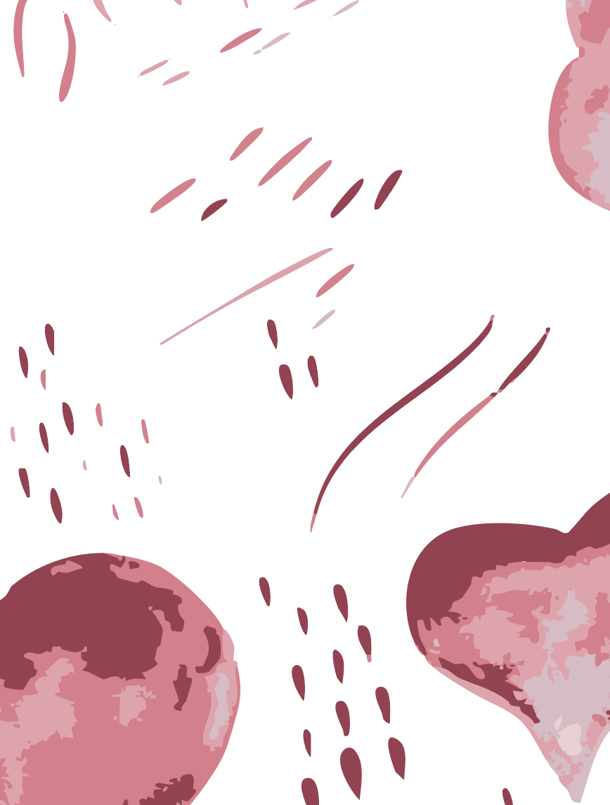
I was considering this challenge because it seemed relatively easy: stripes. There are few things more basic than a stripe. You can literally just paint lines and you can get a stripe. While I’m not entirely sure what makes a stripe sophisticated, I interpreted it to mean simple shapes and a very minimal color palette. Again for this challenge, I wanted to use artwork that I was already creating rather than stress about creating something new or perfect for a specific challenge. I thought about repurposing my sketchy trees from January into a stripe pattern. I pictured making them very very small and creating visual stripes with the motifs arranged vertically. But days passed and I never felt particularly motivated to revisit those trees and start the process of arranging them in a new and different way. Then, while finishing up working on my Valentine’s Day climbing card, I was drawn to all of the tiny marks I made while working in watercolor for that project. I had created lots of swoops, swooshes, dots, and teardrops to serve as additional elements that I might use in my Valentine’s Day card. And I was struck by the idea: what could I make with these smaller details?
Original marks from Valentine’s Day Card.
Marks resized and colored.
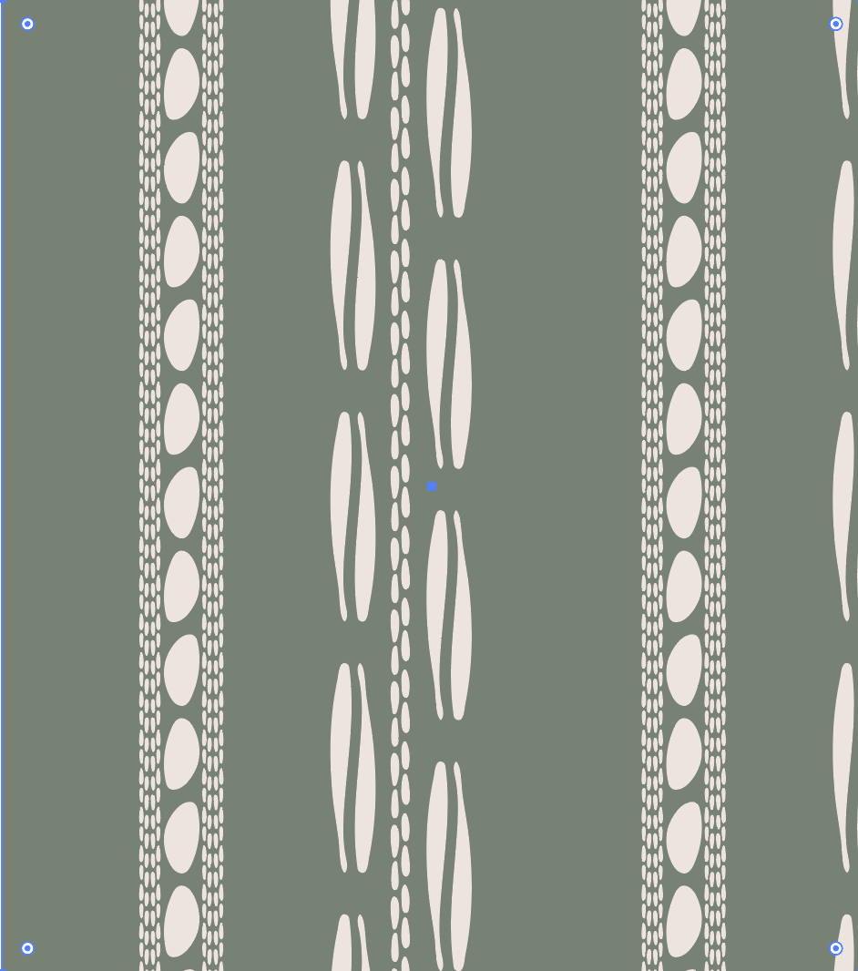
I pulled over a small selection of these tiny details into a new Adobe Illustrator document, most of which were smaller than an inch in their original format. I settled on a small selection of shapes to start building my pattern. For color, I actually went back to a color palette from my Tread collection. I wanted this to be a very simple color palette, and I chose a sage green to be the background color and a cream for the individual motifs. Since I was designing for wallpaper for a second time, I wanted to play with the size of the motifs and create vertical movement with the different shapes. The skinny vertical lines are about 5 inches tall, the small stone-like shape is 1.5 inches and the smallest grouping of lines are less than an inch tall. I played with the design a lot, changing the spacing of stripes, the size of motifs, and the density of the motifs together. Finally I got to a place where I liked the sizing and the spacing, but the overall design felt a little flat. So I decided to go back to my Tread collection again and find a texture that I created using similar watercolor marks. I added this as a layer to the background in a slightly darker shade of green and suddenly the overall look of the pattern was totally different. The texture itself even created a subtle stripe texture in the background that I actually really enjoy.
What I love about this pattern is that it was created with such simple organic marks that I created in watercolor. Creating patterns is making me look at my artwork in a completely different way. I am learning that I do not need to be an expert in drawing and that I do not need to create complex paintings in order to create a pattern. I am learning to look at simple mark making in an entirely different way and how I can turn those simple marks into a complex pattern.
To me this pattern is very earthy. Depending on my mood it reminds me of conch shells at the beach or grassland, like what you might find driving through the plains of Colorado or Wyoming. The first thing my husband thought of was coffee beans and I wonder what this pattern might look like if I made the main skinny vertical shapes a bit more short and fat and if I changed the colors to be deep browns.
Challenge Results: I came in 1750 out of 2321 entries in the Spoonflower challenge with 24 votes. Top design got 326 votes. Check out Vertical Earthy Pebbles on Spoonflower. Available in wallpaper, fabric, and home decor.
What do you think? Which challenge submission was your favorite? What would you change?
Check out J. Gagnon Designs on Spoonflower
Do you like fabric, wallpaper, home decor or are looking for the next item to use in your crafty project? Check out my complete Spoonflower shop. Sign up for my newsletter and you’ll always be in the loop for new designs and products.


