2024 Watercolor Sketchbook Tour Part I
Filling the first pages of my watercolor sketchbook did not go how I thought it would. In anticipation of putting too much pressure on myself to make my sketchbook “pretty,” I had the idea to ease into my first watercolor sketchbook by trying some tutorials. That way I could get over the blank page scaries, explore some new techniques, and get used to what it would be like to work in a sketchbook.
Much to my surprise, the first pages in my sketchbook are not tutorials, but are mini paintings based on either photographs I’ve taken or photos or reels that caught my attention on Instagram. Also to my surprise, I don’t hate any of them. I finished my first sketchbook painting after a long day at work. I noticed I was starting to spend more time thinking about what I wanted to paint rather than actually painting. (This would be a trait of a procrastinator perfectionist, IYKYK). So I scrolled through my phone, found a rather blah photo, grabbed my Strathmore 400 Series Watercolor Art Journal, and decided to set a timer for 20 minutes and just see how it went… It was not…terrible.
My First Impressions
It is very different from working on loose paper. I wanted a larger sketchbook and I had to figure out how to keep the book open and the pages flat. My not very elegant solution was binder clips. I knew I didn’t want to create full page paintings, at least not yet, so I also had to think about how I wanted to position the paintings on the page. I also decided that I would only paint on one side of the paper for now. I know that many people paint on both sides, but I wanted to see how the paper holds up and how the book expands as I work my way through it. If I get through the full 25 pages of the sketchbook and decide I do not want to use the other side, I think I feel ok about splurging on another one. I’ve also noticed that there are two textures of paper in this, alternating between each full spread. One texture reminds me of almost an egg carton pattern and then the other texture is quite smooth. So far the different textures have not really impacted how I have been using the pages.
Reference photo for Bird Island, Tabor Lake
Top: Bird Island; Bottom: Pine Valley Ranch
Bird Island, Tabor Lake, Wheat Ridge, Colorado
I ride my bike or walk by this spot all the time. This is my local park and I love seeing how it changes with the seasons every year. In winter, the colors are cool blues, bright golds, and deep reds. When I took this particular picture, it was really windy on my walk, so much so that there were white caps on Tabor Lake.
Pine Valley Ranch, Pine Colorado
I keep revisiting the photos I took on our hike at Pine Valley Ranch. I loved the color of the frozen water and how the golds of the dead grasses stood out against the snow. This sketchbook painting has been my longest to date at 90 minutes.
Loving this read? Never miss a post, update, or collection release by joining my newsletter.
Top: Birds, Bottom Krummholz
Birds on a Branch
This painting was inspired by an adorable Instagram reel that showed up in my feed. Instagram always knows what my heart desires. If you do not have Instagram, it was a short video of a bunch of bluebirds (I think) huddling together on a branch. It starts with only a few and then there are a bunch of them by the end all snuggling together. I played with what table salt would do to create the textures on the pink background.
Krummholz
If you do not follow the National Parks Service Instagram account, you are missing out. Whoever is running their social media is a genius and I was struck by this photograph of twisted trees that they posted recently. Apparently, krummholz trees are trees that become twisted or stunted under extreme conditions at high elevations, including heavy snow and wind. I see trees like these all the time when hiking up in the mountains, but didn’t actually know they had a special word. It comes from the German word for “crooked wood.”
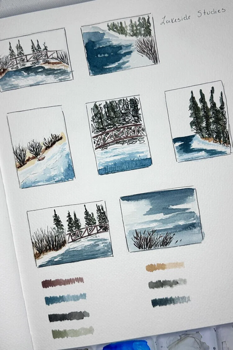
Lakeside Studies
Lake Studies thumbnail drawings.
This is a series that focuses on different aspects of the same reference photo, also from our hiking excursion to Pine Valley Ranch. I was inspired by another artist I saw on Instagram (I forget who unfortunately) who was talking about how she likes to paint the same reference photo multiple times, either experimenting with the same scene in different colors or focusing on a different aspect of the photograph. I decided to sketch and then paint a series of thumbnail sketches using the same photograph as the inspiration. It was a fun exercise and I could see it as a quick way to explore ideas before diving into a bigger painting or even a series.
The Clachan Pub
This is actually the second attempt at painting this pub in watercolor. I hated the painting on my nice paper so much that I stopped halfway through and tossed it, which doesn’t happen very often. To recover, I actually did a small pen drawing in my other sketchbook (stay tuned). I enjoyed that little sketch so much that I decided that I would attempt another watercolor painting, but this time in my watercolor sketchbook. I started out with a simple sketch in pen and then added the watercolor afterwards.
Clachan Pub, Dornie, Scotland.
Which is your favorite?


