Steps to Paint a House Portrait
House portraits are one of the first things I started to paint when I was confident enough to stop watching tutorials. I love the structure of them: the straight lines, the use of perspective, and how they are illustrative rather than a perfect representation of a house. My most recent house portrait project was for a friend who wanted to give a house portrait of his childhood home to his parents that were moving. And he didn’t just one one painting, but five. Here are the steps I take to complete a house portrait.
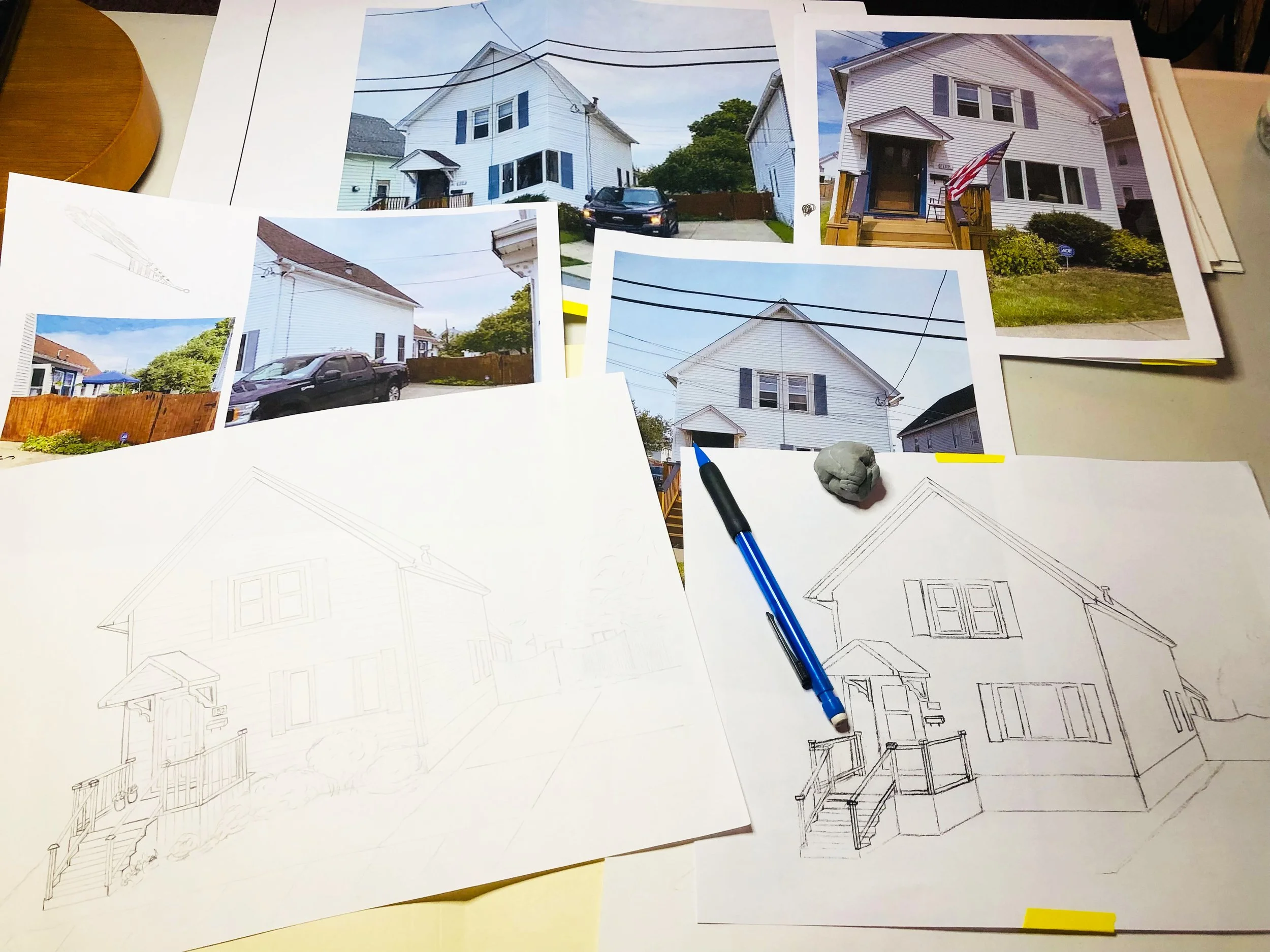
Gathering different perspectives of the house to create a draft sketch.
Create a Composition Sketch
When I start working on a house portrait, I like to gather all of the possible images I have to get a sense of the house, its proportions, and the surrounding landscaping. This includes photos that have been sent to me and online listings like Zillow or Google maps so I can see the house from various angles.
Sometimes the orientation of the final painting will be different than the actual photographs I have, so the Google and Zillow images can help create the desired perspective. The most common orientations for house portraits are either a front facing profile or a side profile. For this project, it was important to capture the defining features of the main house, but also the garage and apple trees from the back yard. This meant that the final orientation was going to be at about a 45 degree angle if you were to stand to the right of the house. Since you are creating a piece of art and not a true to life copy of the house, you can eliminate the elements you do not want, such as the power lines and neighboring houses.
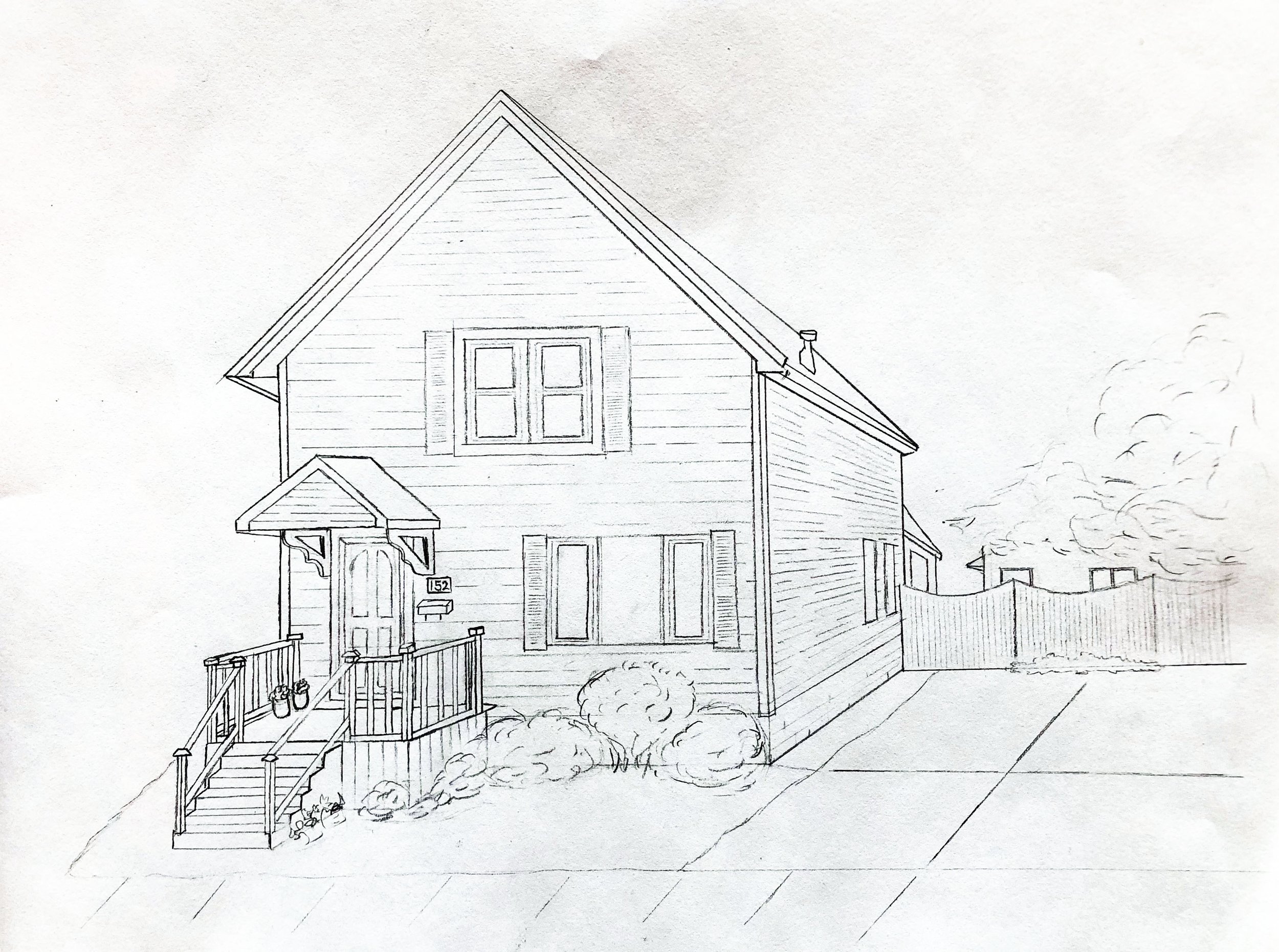
To get started, I printed out numerous angles of the house and used sketch paper so that I could draw and erase to my heart's content as I created the composition. Since this house had a lot of angles, especially on the porch, this made it easy to draw perspective lines that I could eliminate from the final sketch. I also worked on a 9x12 piece of sketch paper so that it was easier to work on the details. Once I had all of my main elements, I used my light table to create a clean copy of the sketch that I then cleaned up further using Photoshop. In Photoshop, I did things such as improve the brightness and contrast of the image.
Final house portrait sketch.
Flag detail ultimately cut from final sketch.
Working on sketch paper and in Photoshop also provided the opportunity to test out elements that the client wasn’t sure about. In this project, we were not sure if we wanted to include an American flag on the front porch. Rather than draw this image onto the actual sketch, I drew it separately. Then I was able to layer the flag on top of the sketch in Photoshop so that you could see versions with the flag and without. I chose to create a separate sketch of the flag because I could work on a larger version (about 4 inches tall) and then resize it to fit with the scale of the painting, rather than try to create a flag that was only half an inch in height. We ultimately decided to skip adding the flag, but it was nice to provide both options. Once my sketch was finalized, I saved it as a JPEG. By creating a JPEG, I could maintain a clean copy of the image and also resize it as needed.
For this project, I created five individual paintings:
Three 5x7s
One 9x12
One 11x14
Enjoying this read? Sign up for my newsletter and never miss a post or exclusive content.
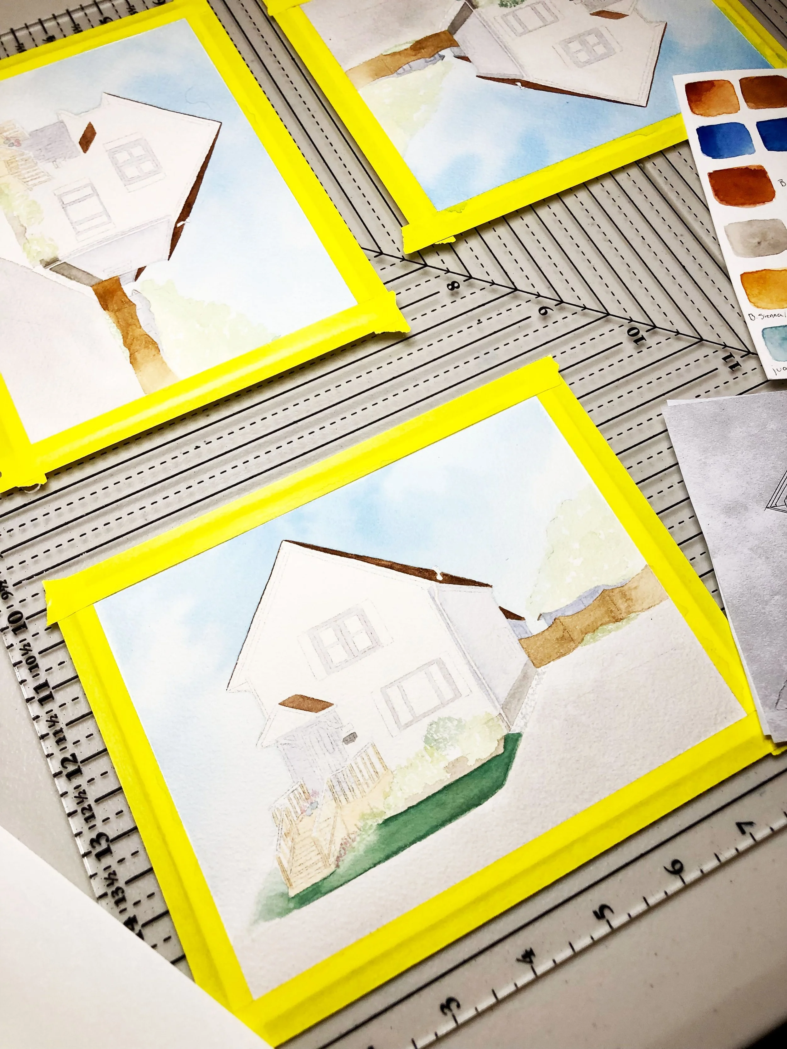
Process shot of three smaller paintings.
Transfer Sketch to Watercolor Paper:
Small Paintings First
Once the sketch was approved, I moved on to transferring the design to my watercolor paper. For this project, I used graphite paper.
When I am painting multiples of the same subject, I start with the smallest paintings first. This allows me to work through some of the details in my head. For the three small paintings, I attached all of them to a plastic square using artist's tape.
This allowed me:
To work on the three paintings simultaneously, which allows for more efficiency by accounting for drying times. It also assures that the paintings look similar to each other as I continually build up layers from light to dark.
To create a clean edge once the artist's tape is removed. The painting's edges appear to fade into the background as a result.
Before I actually start to paint, I also mix up my colors and make notes of what I used. This comes in handy once I complete the minis and move onto the larger paintings. While all of the paintings will have some subtle differences, at first glance, I want them to appear to be identical copies. I want you to notice the subtle differences and personalities of each one the longer you spend looking at them.
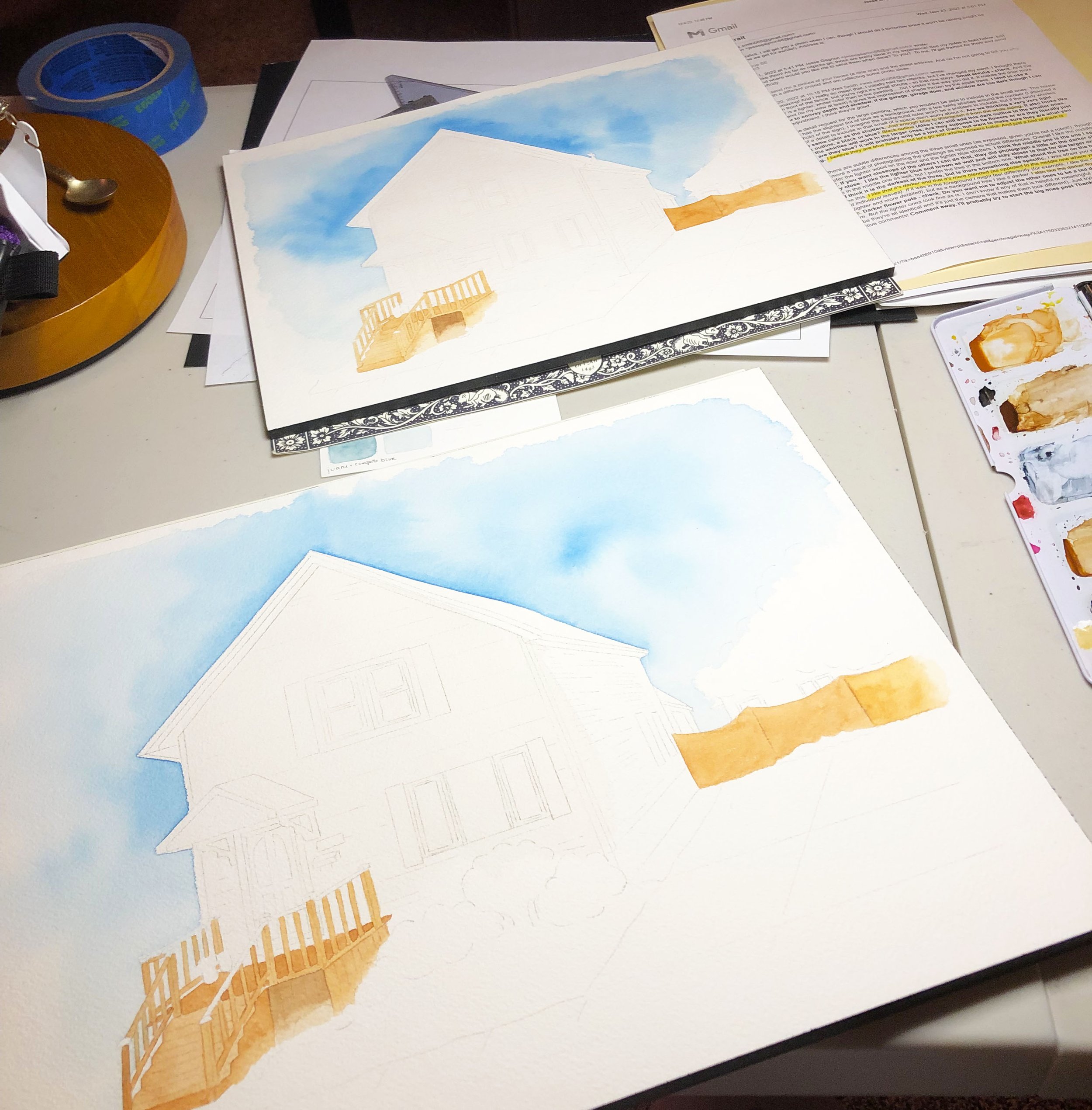
Process shot of first layers of larger paintings.
Larger Paintings Next
Once the three little paintings are done, it's time to move onto the larger paintings. Since I already have my sketch as a JPEG it is easy to resize and print a 9x12 and a 11x14 outline. Then I use graphite paper again to transfer the image to the watercolor paper. I keep my original sketch close because it has some details that I'll want to complete freehand on the final painting, things like the flowers, shrubbery, and house number.
A larger painting means you can include more details than was possible with the smaller ones. An important detail for the larger versions was the house number and the flowers surrounding the number.
Let them Sit
Once all of the paintings are complete, I like to let them sit for a period of time before giving them a final review. It helps me notice things that I might have missed and make adjustments so that they look cohesive as a group. Last but not least, it’s time to take some final photographs of the completed projects and send them off to their forever homes.
Final versions of all five smaller paintings.
What do you think? Do you like painted house portraits or is a photograph better?


