Experimenting with Abstract Landscapes
I have always found abstract landscapes to be fascinating. I think it is because I have never felt that my brain worked that way. I tend to be very representational, literal, ordered, precise, all of the things that I never feel when I am looking at abstract art. The adjectives that come to mind when thinking about abstract art are loose, experimental, and emotional. This fall, I have been in the middle of a creative burst fueled by all of our hiking, especially in the alpine, here in Colorado. I’ve painted aspens, pine trees, mountains, meadows and more. You can see what I am talking about in my recent post Fall Mini Landscapes. I’ve also been painting small, which means that I can move onto a newer painting rather quickly. Most of my minis, which are in the 3 x 4 inch to 5 x 7 inch range, can be finished in one to two hours. This consistency in my painting paired with my sketchbook practice have left me feeling confident in my abilities and less disappointed when something does not go according to plan.
So I have been experimenting. I found myself turning over the idea of a deconstructed landscape, one that would include my favorite elements of hiking here in Colorado: alpine lakes, aspens, pine trees, mountains, etc., but in a new and different way. I wanted to play with a simple color palette and paintings that had a certain amount of white space. I wanted to create a series of paintings that were not representative of a particular photo or scene, but that illustrated what I love most about being in the alpine: the quiet, the expanse, the solitude. With these ideas in mind, I did a quick jot, a technique that I learned from Bonnie Christine that is meant to get the big ideas out of your head in their simplest form. I created a series of four mini drawings that combined these elements in different ways. I worked quickly, with each mini drawing only taking about three-ish minutes to create. I also added notes to label the key aspects of each of the paintings. I found that with these sketches I was exploring not only abstraction, but also surrealism. I found myself wanting to play with orientation, proportions, and the combination of these elements. I was incredibly excited to get started and also prepared for it to be a total disaster.
When I first created this page in my sketchbook, I envisioned creating four paintings to illustrate each idea in watercolor. To my surprise, this experiment has led to ten paintings so far. Each one harkens back to the original sketches, but after feeling content with my first attempt, I found myself wanting to explore and expand further upon the ideas and techniques that I was experimenting with. While I certainly like some more than others, I would not consider any of them to be a failure. I can see how my ideas are continuing to evolve with each version. Below, you’ll learn about my initial idea with each sketch and how that changed as I began interpreting the idea in watercolor.
I would love to know what you think about this new direction, and which paintings are your favorite. Check out my Etsy Shop to see what artwork is currently available.
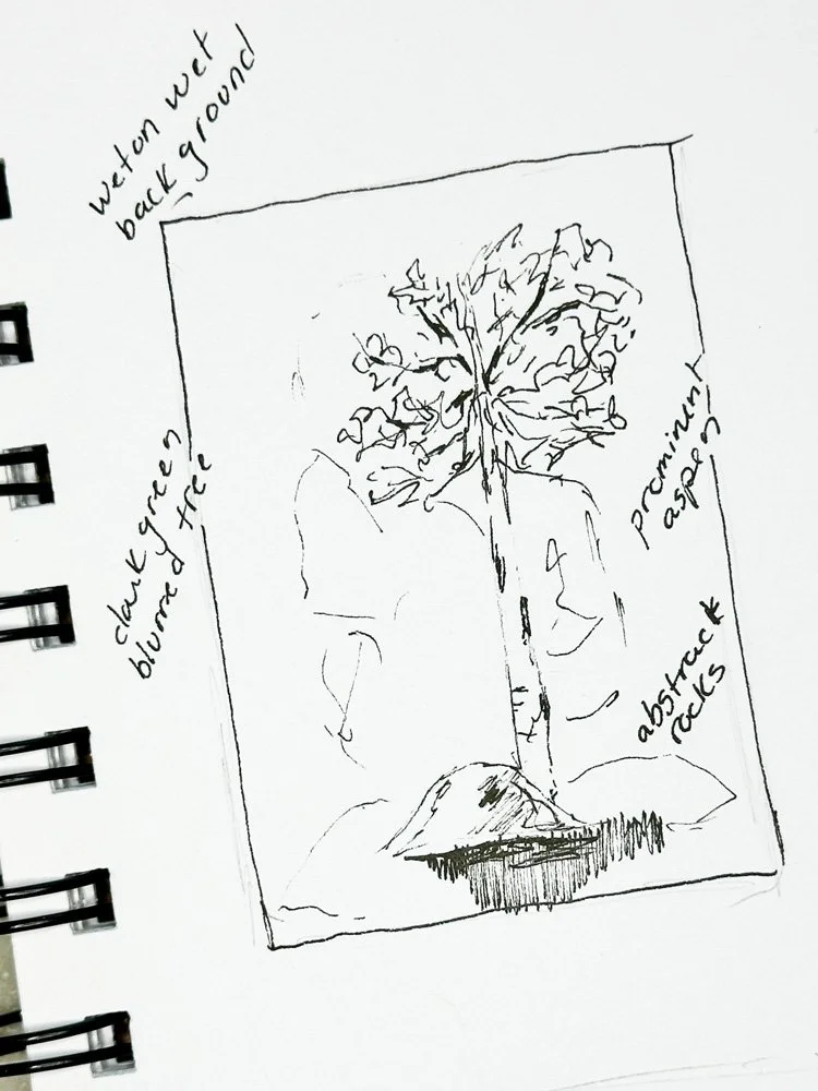
The Solitary Aspen
In this sketch, I wanted to play with the idea of how aspens grow in the mountains. I wanted to use the wet on wet techniques to give a hint of pine trees to contrast against the aspens at their peak in the fall and I hoped to explore the rocky backdrop you often find in the mountains.
Aspen Roots I
The unexpected surprise in this first painting was playing with the roots of the tree. One of the fun, yet challenging, aspects of watercolor is that it can be unpredictable. I played wet on wet quite a bit on this painting, which left some unusual shapes. Instead of creating rather standard rocks as the base of the painting as I outlined in my original sketch, I decided to lean into the interesting watermarks in the paint and created a system of roots underneath the trees.
Aspen Roots II
In the second version, I wanted to expand upon the idea of a root system below the ground of the aspens and to improve the overall proportion of the trees. In my mind, aspens are tall and almost gangly, while pine trees are tall, straight and narrow. I also wanted to improve the contrast between the pine trees and the aspens.
Aspen Roots I
Aspen Roots II
Enjoying this read? Join my newsletter list and never miss an update!
Solitary Aspen
Solitary Aspen is the closest to the original sketch concept. I decided to combine micron pen drawing along with watercolor. You might have noticed that the central rock in the painting is only done in pen and no color. The hardest part of this piece was keeping it simple. I wanted it to feel very minimalist.
Fiery Aspen
Fiery Aspen builds on the ideas in Solitary Aspen by combining pen work and watercolor. I wanted the trees themselves to be almost devoid of color. When I look at this painting my attention starts at the edges and works its way in towards the center. I painted much of this painting upside down to create the desired effect with the colors.
Solitary Aspen
Fiery Aspen
Falling Water
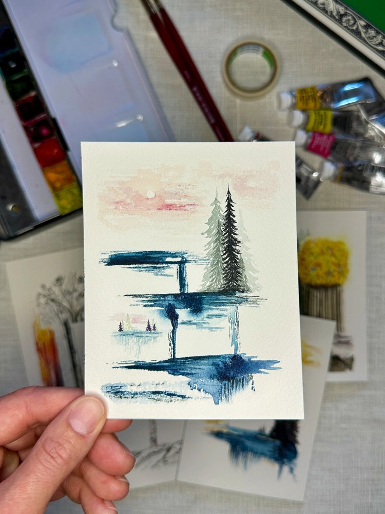
Our favorite hikes in the mountains are those that have alpine lakes and it is even better if the hike has more than one lake along the way. In this sketch, I imagined a hike as if the lakes were stacked on top of each other in space. I wanted the water to be the focal point and for them to seemingly fall into each other, much like the connecting rivers and streams connect alpine lakes. To place the water in a forest and mountain context, I wanted pine trees to be the other defining aspect of the painting. This has been, by far, my favorite concept to explore and I may find myself painting many more versions of this idea.
Falling Water No. 1 with Gold
I kept my color palette really simple using indigo from my Winsor & Newton painting palette. I love this deep blue, but it has rarely made it as the primary color in my work. It was fun to see how many shades I could achieve just by varying the amount of water I was using. I used black and purple for the trees and then made a last minute decision to add a pop of color by adding the sky in yellow ochre, one of my other favorite colors and one that pairs beautifully with the indigo. Here I start to play with orientation and you might notice the small bunching of upside down trees at the base of the first blue pool.
Falling Water No. 2 with Pink
For this second version, I wanted to keep indigo as the feature color, but add more of the “falling” aspect of the water. I wanted it to be like several deep pools of water were feeding into each other. To change up the color palette a bit, I utilized green for the trees and made the sky a shade of pink. I think that this version has much more movement than the first.
Falling Water No. 3
The third version interprets the theme on a slightly larger scale (4 x 6 inch as opposed to 3 x 5 inch) and the most significant difference is the contrast of green and gold pine trees.
Falling Water with Gold
Falling Water with Pink
Falling Water No. 3
Inverted Alpine
With this third sketch, I am really playing with the idea of orientation. I have my favorite elements of the previous paintings: the aspens, the pine trees, the alpine lake, but the orientation is open to interpretation. This idea does not seem fully developed yet and I may have to come back to this idea still.
Inverted Alpine No. 1
This first version captured the concept of my original sketch, but I do not feel like it has the looseness or experimentation that the other paintings have. It seems rigid and contained, which is not the feeling that I wanted to explore.
Inverted Alpine No. 2
My favorite part of this second painting is how the aspens seem to be surrounded by the falling water and how the pine trees seem to dwarf the aspens in proportion.
Inverted Alpine No. 1
Inverted Alpine No. 2
Floating Mountain
With this final sketch, I wanted to incorporate mountains. The mountains can be such a formidable presence depending on the hike and the weather. When I first moved to Colorado, I found the mountains to be incredibly intimidating. They felt looming and intense. Now that I have lived here for a while, I now view them as powerful, if not empowering, and would like to figure out a way to evoke those feelings.
Floating Mountain No. 1
I’ve only played with this idea once in paint, though I am hoping to come back to it. While the sketch has the water coming from seemingly nowhere and the trees inverted, I decided to keep this version simple. I love that that mountain and the solitary tree seem to be floating on the water. And I love that the pop of pink is unexpected. I’m excited to come back to this idea more.
Floating Mountain Initial Sketch
Floating Mountain No. 1
Final Thoughts
This period of experimentation took me in a direction that I wasn’t expecting. I wasn’t expecting to like the ideas so much to want to try them over and over again. I didn’t expect that I would still be intrigued by the ideas and want to explore them even more in the future.
Is there a piece that you find particularly interesting? Let me know in the comments! I’m slowly adding my favorite paintings to my Etsy Shop. Check it out to see what artwork is currently available.


