
Designing my First Valentine's Day Card
Ahh February, the month of LOVE. 2025 is all about experimentation and trying new things. As I started to brainstorm product ideas for the year, I added “create a climbing-related Valentine’s Day card.” I had no idea what that would entail, if that would be easy or hard, if it would be entertaining, or totally lame, but it was on the January Task List, so I was now on a mission. One of my long-term goals for the year is to work on my second ever fabric collection, which will have a rock climbing theme. This means that I am starting to accumulate a lot of climbing related drawings and sketches that I hoped might serve as the inspiration for a Valentine’s Day card. Here is the good, the bad, and the ugly, of how I designed my first Valentine’s Day Card. If you are in need of a last minute Valentine’s Day card for the climber in your life, check out my digital download over on Etsy.
Brainstorming Ideas

Inspiration and brainstorming sketches.
The first thing I realized was that January was way too late to do anything substantial. Ideally, I should be working on ideas three to four months before the actual holiday, but hindsight is 20/20 and I knew that I would always find some excuse for why not to do something. So while I might have envisioned a collection of cute Valentine’s Day cards that I could release all at the same time, I decided I would start with my simplest idea and see if it was even possible to design a card by the end of the month. I started in my sketchbook, creating a list of cheesy climbing phrases, a list of climbing-related elements I might include, along with the standard elements of most Valentine’s Day designs - hearts. Ideas I played around with included:
Carabiners
Rope
Quickdraws
Harnesses
While I love all of the ideas I sketched out, I knew that I only had the time and energy to focus on one. So I settled on the idea of a climbing rope that has been tied into the shape of a heart. From here it was time to work on the actual sketches.
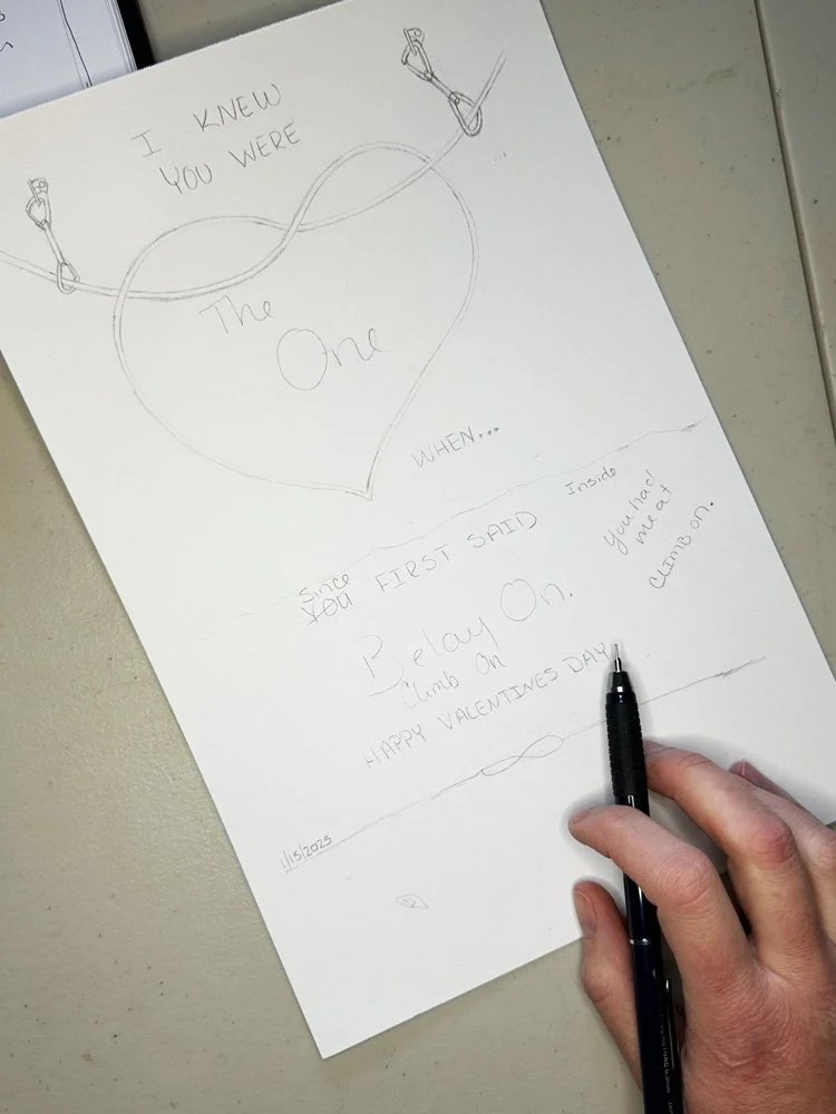
Creating the Artwork
With my mini sketchbook drawings as my guide, I started creating larger artwork. I decided that to firmly identify the climbing theme, that my climbing rope in the shape of the heart would actually flow through two hanging quickdraws. The quickdraws took the longest time to figure out the size, angle, and how the rope would fit through the carabiners. Once I had the basic shape, I also started to work on the text. I went through a few different iterations of what text to include on the inside and outside and even brought my climber-husband in on the project to help make sure that the text would ring true. After mocking up the text for the inside of the card, I decided that I needed another climbing element for the interior. I settled on a tied figure eight knot. Once the drawings were the way I wanted them, I created final clean versions in pen. Creating clean lines would be really important once I tried to bring the designs into Adobe Illustrator to turn them into vectors.
The final stage of creating artwork was to create the hearts. I decided that I would paint a bunch of hearts and organic marks using watercolor paint. I hoped that I would be able to translate these paintings into vectors that would preserve some of the watercolor texture that I love so much.


Vectorizing in Illustrator
I scanned all of my final artwork, including my drawings and painted hearts, and turned them into vectors in Adobe Illustrator. Here I encountered my first challenge. First, I realized that some of my little details to indicate texture on the rope and carabiner did not vectorize well, so I ended up having to spend a lot of time cleaning up the lines so that they were smooth. If I were to do this project again, I think I would make my final sketches much larger so that it was easier to have thick clean lines to work with. The second challenge I encountered was when I vectorized the hearts. I love that I was able to take the scans and convert them into vectors with a range of 3-4 colors, but I didn’t like the edges of each color. I tried and tried to smooth out the edges so that the hearts would look the way I wanted them to, but to no success. This is definitely an area of Adobe Illustrator that I need to do some more learning on. I know there is a way to preserve the texture and brush strokes of watercolor, but I haven’t mastered it yet. I decided to move on. I still liked the organic nature of my painted hearts, so I decided to make them a solid color. A happy surprise when I vectorized my page of hearts was that I loved the organic marks that I filled the pages with: dots, dashes, and swoops. I feel like I could do all kinds of patterns and designs for Valentine’s Day with those marks alone, but I decided for my simple card, that I would use them to add accent colors to my hearts.

Vectorized watercolor hearts; something I still need to learn in Illustrator.

Final motifs in Illustrator.
Loving this read? Join my newsletter and never miss a post, new artwork, or product.
Final Design, Mockups and Testing

Test prints and mockups.
With all of my elements finalized, it was time to assemble my final design. I settled on a 5x7 inch card size, since the internet told me that this is the most commonly purchased card size. The nature of my designs fit with a horizontal orientation best. The three main sections of the card were the cover page, inside message, and then branding on the back of the card. Since I knew that I wanted to create a digital download, I built my design on a letter sized (8.5 x 11 inch) artboard in Adobe Illustrator. I created guidelines to identify the perimeter of my card, which is 7 x 10 inches when unfolded and started to assemble my motifs. Since this card would have interior content, I had to learn how to orient the different elements so that they would print at the right orientation when printing double sided. It took me a few rounds of printing until I got this orientation correct. Once all of my elements were centered and oriented the right way, I turned my original 7 x 10 inch guidelines into a dashed trim line so that a customer would know how to cut the document down to size.
Once everything seemed correct, I sent the design to some of my climbing friends, my art study group, and posted it on the Flourish community page (Flourish is the membership I joined after Immersion.) With their comments and suggestions I made some final tweaks. One thing that was confirmed was that this card is super niche. If you are a rope climber, you get it instantly. If you are not, I found that people still thought the card was cute, even if the subtleties were lost on them. This led me to make a second version of the card that has space for somebody to add their own message. I even created a list of phrases in case somebody was stuck on what to write.
Prepping for Etsy
The final step with my final product in hand was to get the files ready for Etsy. I need to finalize the PDF files and print samples. I also took all of the product photographs that would show the details of the product including what the customer would receive, what work they would have to do (trim & fold) and what the final product would look like. This also included all of the details so that a customer would understand that they were only getting a digital download. This means they would receive the pdf file of the final artwork, but they would have to take the final steps of printing, trimming, folding, and getting an envelope should they want one.

Card printed on letter sized paper.

Final card trimmed and folded.

Interior text of card.
What I Learned
This was definitely a process. It took a while to map out ideas and create the artwork before I even started to vectorize in Illustrator.
I have more learning to do when it comes to translating my watercolor work into vectors. I didn’t give myself enough time to really accomplish what my initial vision was, but I was able to pivot to a design that was similar but equally cute.
Figuring out how to set up the card file in Illustrator took quite a bit of time because I had never done it before. I spent a lot of time on Youtube figuring out which way would work best for me.
Testing is key. I printed out lots of copies of the card making sure that all of the elements were printing the way I wanted them to. I started with printing black and white mockups and saved the final color prints for the end.
Once your card is finished, you need to think about all of the questions that an end user might have about what exactly they are purchasing. I spent a lot of time looking at other Etsy sellers that do digital downloads of 5x7 cards to see what information, pictures, and descriptions they use so that there is no confusion or barrier to purchasing.
Overall, I love this card. It’s an idea that has been floating around in my head for months before I sat down to see if it was even possible. Now that I have created the one card, I know that the next one will be easier.

Now available on Etsy.
A digital download for the favorite rock climber in your life. Happy Valentine’s Day!